Chapter 1: Melbhattan

0

Monday 26 November 2012


Illustration by Oslo Davis, via Melbhattan

When I heard about the release of Melbhattan I thought perhaps Christmas had come early this year, 3 of my favourite things all wrapped up into one beautiful little animation - Melbourne, Woody Allen & of course illustrator extraordinaire, Olso Davis.


Illustrations by Oslo Davis 

Part homage, part pastiche, Oslo has taken the opening sequence of Woody Allen's much loved ode to Manhattan, and through his clever scouting and sketching of our intriguing city, has replaced Manhattan with Melbourne. While romantic black and white images of Melbourne immediately spring to mind, Oslo's original intent was to set sentimentality aside and instead "ridicule the sizable proportion of inner city Melburnians who think our city is a mini-Manhattan".

He explains, "the idea that Melbourne is an antipodean Manhattan is not a new one, but after my wife and I returned from a stint in Tokyo, Melbourne seemed more New Yorkery than ever. It was 2003 and the people here seemed pushier, richer and crankier. More ''whatyatalkingabout?!'' and less ''excuse me''. Everyone was banging on about how the cultural capital of Australia was also the most livable city in the world. The Brooklyn hipster movement was taking hold in Collingwood. People were only half joking when they called the areas north and south of Johnston Street NoJo and SoJo, and developers began building an ''Upper West Side'' on King Street and flogging ''New York-style studio apartments'' in Flinders Lane. Former Melbourne Writers Festival director Steve Grimwade, who made The New Yorker magazine a focus of this year's festival, said on independentaustralia.net that ''Melburnians have looked … to places they can aspire to be like and, in many ways, New York is [that] city … ''

Then why not "cast Melbourne as New York in the style of Woody's Manhattan, to both charm and roast without being mean" Oslo thought. However, as Oslo confesses, over time (and perhaps with a little resistance) what was intended to simply be "a good-natured ribbing" grew into a "nervy, twitchy animation" that shows he too, like the best of us, is "a little too romantic about Melbourne". But hey who can blame him, with a city like ours, it's hard not be.


Melbhattan premiers at Rooftop Cinema at sundown on Sunday, Dec 1 (romantic indeed). It will then screen before every Rooftop cinema film throughout December.

Design Hero #2 - Robin Boyd

0

Monday 8 October 2012

Left - Image of Robin Boyd via The Robin Boyd Foundation. Right - Image of The Featherston House via Boyd Homes Group.


Many of Robin Boyd’s 1950's residential gems are discretely hidden throughout Melbourne’s leafy suburbs; yesterday
The Robin Boyd Foundation hosted an open day providing Melbourneans with the unique opportunity to venture through 6 incredible Boyd houses including the much acclaimed Featherston House in Ivanhoe. A few friends and I spent the afternoon exploring these spaces, amazed that such modernist masterpieces could exist within our city. We were curious to know how the original owners inhabited the spaces and how the current residents have adapted these homes to meet with their modern needs.

The 6 houses opened to the public included Holford House, Uglow House, Ednie House, Albert Date House, Featherston House and Flat and Walsh St (Boyd House 2) – originally designed by Boyd for his family and now owned and maintained by the The Robin Boyd Foundation.

The Featherston House then and now.
Images via The Robin Boyd Foundation and Boyd Homes Group.

Tony Lee, architect and executive director of the Robin Boyd Foundation, has described Boyd as "an incredibly intuitive person who understood his clients and was very empathetic to their lifestyle". This is immediately evident when walking into each space as every house reveals a great deal about it’s original owners and the way they chose to live within it. It’s obvious that many of Boyd’s clients were quite radical and experimental in their approach, challenging the typical 1950's modest but modern Australian home by creating a residence that was an extension of who they were. 

As open plan living is something I have always loved, The Featherston House and The Date house had a real impact on me. Both houses share similar features including free floating platforms of living space and sheer walls of glass that immediately bring the outside in. The Featherston House takes this one step further by actually allowing you to feel as though you are living in a garden. Boyd utilised natural outdoor elements within the interior such as plants and ferns, stepping stones that act as small stairways and a fishpond, blurring the lines between indoor and out. Even the translucent glass ceiling reminds us of the natural word as the light changes or falling leaves create patterns on its surface. Mary Featherston, the original owner described her bedroom, set on the highest of the four living platforms, as “a nest”, a space of dizzying height with an incredible view, in what many like to refer to as an architectural tree house.


The Albert Date House, image via Boyd Homes Group.

What I find so charming about these houses is that most of their beauty is concealed from street view, however once you step into the space all is revealed and you are immersed within a completely unique environment. The orientation of the brick walls and sheer walls of glass are designed to conceal the view of the suburban setting and instead draw your focus to the natural landscape. 

The theme that constantly came up throughout the day was the livability of the spaces, an ongoing debate we each had very different views on. Some of us questioned how safe the various floating levels and stairs would be if children lived within the house, while others queried the size of the living areas and how it might feel when friends or guest were invited over – would it be a good space to entertain in? Is it possible to have a living garden indoors? How do you insulate a space with so much glass throughout the hot Australian summer? The answer that we kept coming back to was an obvious one, and that was that each house was intentionally designed to accommodate the specific needs of its original owners, so to assume that it should adapt without compromise to families today is almost absurd. Having said said that it was intriguing to see how current owners had adapted these spaces, and the impact that seemed to have on the overall concept. Unfortunately the current owners of these properties were not present throughout the day, but it would certainly have been fascinating to discuss how they live within the space now.

The Robin Boyd foundation hosts regular seminars, lectures and public events, you can find out more about the organisation here.

The Plywood Nest

0

Tuesday 24 July 2012


So I've decided that in my next life I want to come back as a Japanese architect. Seriously, are they not the coolest people on the planet? In 2010 I travelled to Japan for the first time and completely fell in love with everything about it - the food (green tea ice cream, don't even get me started), the people (the sweetest you will ever meet), the game shows (OMG - amazing!), but mostly, the design. So simple and beautiful, yet so incredibly unique. Ichiro-iro is the perfect example of this.

Ichiro-iro is a series of furniture designed by Torafu Architects, for the decorative plywood maker Ichiro. Ichiro creates
in-house blends for the paints used in its polyester plywood, demonstrating a consistent dedication to supplying the right colour that involves a willingness to custom-tint even single sheets.


The concept for the Ichiro-iro series is that of 'tools for the real you' – 'iro' being the Esperanto word for 'tool'. The first items in the series are the koloro-desk and koloro-stool. 'Koloro' is also an Esperanto word, meaning colour, and the koloro pieces have been designed to make optimum use of the vibrant polyester decorative plywood at which Ichiro excels.

First launched as prototypes in yellow and sky blue, new colours including white, pink, khaki, and navy have been added to make a total of six colours available. The stool now comes in 4 colours including grey, dark grey, light-blue and green. The magnets allow for smooth opening and closing of the windows, and the small doors on both the left and right have been adjusted to be used as shelves. 


Torafu Architects describe the koloro-desk as a "place to 'nest' at ease".  It has windows at various locations, opening to give a more open, accessible feel and when closed creates a small private room, free from disturbance. Lighting and potted plants can be added, and there are windows for displaying the occasional ornament, hooks for bags, and a cord manager allowing computer use. 


The koloro-stool comes complete with storage capacity. Designed to complement the koloro-desk, the stool is shaped like a vaulting horse, and under the soft cushioned seat is a box for storing toys and other small miscellaneous items.


All the above Ichiro-iro photographs were taken by Akihiro Ito & styled by Fumiko Sakuhara. Images via Torafu Architects


I am already dreaming up a wish list of items that I would like to place in my Koloro desk (when I finally have the chance to buy one). I'm not sure that it's quite enough room for a work desk, so instead I thought it might make a nice telephone desk.  A beautiful little nook to sit at and chat with friends, while scribbling away in notebooks or flicking through the latest design magazines. Here are a few objects that I think would work quite nicely...


My Wish List:
  1. The Koloro desk - with so many great colours to choose from I had to go with my favourite colour, yellow.
  2. The Mod Collective's stunning ceramics.
  3. A collection of design magazines.
  4. A vintage Ericofon - seriously the coolest phone ever invented.
  5. A Float Light by Benjamin Hubert, from Great Dane Furniture.
  6. A framed hand woven artwork by Significant Others.
  7. Wooli bespoke yarn and knitting needles by Nikki Gabriel. I like to think I can knit and speak on the phone at the same time...perhaps that's a little too ambitious.
  8. A leather bound notebook for drawing quirky little characters and keeping track of ideas.

What would you fill your Koloro Desk with?

Ordinary Accidents

0

Tuesday 17 July 2012


So last week I had a little mishap. In my usual mad morning rush I clumsily slipped on a wet step and flew through the air landing firmly on my wrist. The instant my wrist hit the ground I knew it was broken, and a trip to the emergency room quickly confirmed that. A few hours later I had a plaster cast on my arm and was told that Id need to wear it for the next 6 weeks. What joy! Luckily its my left arm so typing and writing is still quite easy...using a knife and fork at the dinner table, tying my shoe laces and getting dressed on the other hand, hilariously difficult. I feel like a kid again.

I came across this editorial from Grey Magazine # 6 and felt it was quite fitting for this post. Fainting spells, trips and spills have never looked so stylish! If only there was a part 2, accessorising your plaster cast. Now that might come in handy.


Hannah Noble, Anna Millonig & Agne petkute photographed by Alessio Bolzoni & styled by Moreno Galata for Grey Magazine # 6, Spring/Summer 2012. Via Real life is Everywhere.

Russell & George

0

Wednesday 11 July 2012


There are a few things you should know about Ryan Russell and Byron George, the creative duo behind Melbourne's award winning design studio Russell & George.

1. They are responsible for some of Australia's most breathtaking retail and hospitality interiors. This includes an award winning series of Aesop and Crumpler stores, as well as Melbourne restaurants Huxtable, St Jude's Cellars, Boire 
& Earl Canteen.

Aesop Doncaster. Photographs by Dianna Snape via Russell & George.


Aesop Perth. Photographs by Diana Snape via Russell & George.

2. After working for the bigwigs (Cox, DCM, Woods Baggot & Hassell, to name a few) Byron and Ryan began independent practises using a common studio space. Naturally they began collaborating on projects and on April Fools Day 2010 formally establish their multidisciplinary design studio, Russell & George. Their goal has been to create design solutions that extend thresholds and blur the line between different fields of design practises, as a result their projects have varied from branding and industrial design to set design, architecture and interiors.

Earl Canteen. Photographs by Dianna Snape via Russell & George.


3. They don't believe in trends. While this philosophy has resulted in criticism at times, I feel it's the reason why Russell and George spaces are so intriguing. Each environment tells a unique story and has a distinct personality based on the product it offers. Materials, communication design and colour each playing a vital role in creating these dynamic design solutions.

Huxtable. Photographs by Dianna Snape via Russell & George


Saturday Swoon

0

Saturday 30 June 2012


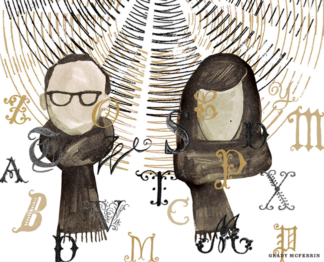
Yesterday, while talking type with a good friend of mine, she mentioned that the extraordinarily talented Jessica Hische and Russ Maschmeyer had announced they were tying the knot. I'm always fascinated by creative couples (particularly their gorgeous homes, wonderful collaborations and unique proposal stories), so I was delighted to hear the news. Now of course being the remarkable duo that they are, printed wedding invitations would have been a little too simple. Instead the illustrator and interaction designer chose to commemorate the occasion by creating a scrolling website that tells the story of their relationship thus far. It's filled with stunning illustrations by friends including Chris Silas Neal and Gilbert Ford, as well as Jessica's beautiful typography. Titled 'The Story of Jess & Russ' it features a timeline of cute anecdotes, from the couples first meeting to the proposal itself. Reading it left me wishing I had an invite to the wedding - it's sure to be a very sweet event.

Images via The Story of Jess & Russ


Winter Woolies

2

Monday 25 June 2012

'Graph Mittens'. image via Donna Wilson


On days like today the only thing I seem to want to do is rug up and stay indoors. It's hard enough to get up on a Monday morning, but add to that a very chilly twelve degrees outside and a car that wont start (it's not a fan of winter either) and really that's enough of an excuse to crawl back under the covers.

A lady who certainly knows how to bring a little colour and cheer to these dreary winter days is Donna Wilson. Donna is an award winning textile designer who has created an irresistible world from the three things she loves most - colour, pattern and craft. Originally hailing from Scotland (the land of cold weather) and now based in London, Donna's knitted creations are manufactured in the UK and made from the softest natural yarns (mainly lambswool). Her quirky characters and stunning homewares are sure to make you feel a little warmer just by looking at them!


'Up the Garden Path Blanket'. Images via Donna Wilson

I'm quickly putting together my winter wish list (I have my eye on the gorgeous 'Graph Mittens' and 'Up the garden path' cashmere blanket). What are your favourites?

You can find Donna's beautiful little creations at Safari Living and online here.

The adorable Donna Wilson. Image via Milk Magazine


THE NEST All rights reserved © Blog Milk - Powered by Blogger